top of page
Lizzi Stuart Ignasher
The Good Time Girls | Title Sequence & Credits
Design
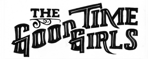
I had the honor to work on the titles for The Good Time Girls while interning at Sarofsky. Knowing this short was a western, I was excited to work with woodcut and slab serif styles. We designed the title first and designed the credit font to compliment it.
For the title design, I started completely analog because I wanted to have more flexibility with the shapes I was making. After a few phases, I moved to the computer to vectorize the design.
For the end titles I designed a font named Clementine (after the main character). I started with a slab serif font. I cut notches in the corners and added diamonds to create a western feel. I added an ornamented capital version to use for the larger use-cases.

bottom of page


